
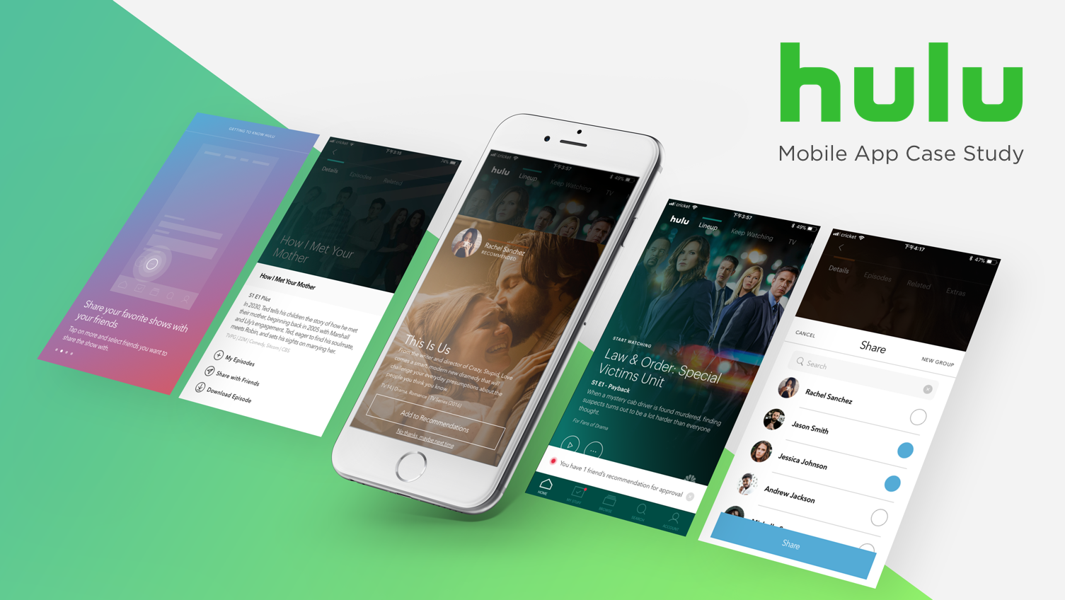
Integrate offline experience and social feature
A Designlab UX Academy capstone project.
00. At a Glance
Hulu, Designlab
3/6/2018 - 3/19/2018 (2 weeks, 80 hours)
Conduct user research, design UI, create prototype, and conduct usability testing
iOS mobile
In-person user interview via Skype, Sketch, Photoshop, InVision, utilized Google Hangouts to conduct usability testing via screen sharing
# of downloads, # of recommendation made and conversion rate
UX Designer: Christine Chan (me), Mentor: Deborah Dennis
CLIENT
TIMEFRAME
MY TASKS
PLATFORMS
DESIGN TOOLS
KPI
COLLABORATORS
Project
Hulu’s mobile app allows customers to stream shows and movies on-demand on mobile devices. It solves the pain of having viewers tune-in to watch TV by having content easily accessible in their pocket.
My role for this project ranged from conducting user research to designing user interfaces and conducting usability testing. I consulted with my mentor Deborah Dennis for guidance and presented my work to other design students for additional feedback.
Challenge
The mobile market has been surging in recent years, Hulu wants to tap into it and secure its place in this market by improving its user experience.
Solution
I was tasked as a designer to tackle this problem. Through this case study I will show you how I solved this problem by adding an offline experience and friend recommendation feature supported by user research and usability testing.
01. Discovery & Research
App Audit
To begin, I downloaded Hulu’s mobile app and conducted an audit in order to gain a better understanding of how the current Hulu app functions, its structure, and to identify Hulu’s design patterns.
Hulu’s existing mobile app is very visually appealing. But its navigation pattern is unique. It has a static bottom navigation with the main playlists and profile functions. I found it hard to browse through titles because I had to scroll vertically instead of horizontally like the common design pattern I'm used to.
Competitor Analysis
I conducted competitor research by comparing Netflix and Amazon Prime in order to deepen my understanding of the current streaming service market. From the competitor research, I recognized that Hulu has a market opportunity in offline streaming services because while both Netflix and Amazon Prime Video offer offline streaming, Hulu does not.
User Interview
To understand our users, I worked with my mentor to come up with questions that would open up conversations with current Hulu users.
I conducted four user interviews via Skype in order to empathize with current Hulu users and look for other potential market opportunities.
“There are too many shows out there. I trust my friends’ recommendations better.”
Key Findings
My interviewees mentioned they usually receive show and movie recommendations from friends in-person. I saw this as an opportunity for Hulu to develop a social feature for users to recommend shows to each other within Hulu’s mobile app.
Content is the most important differentiator between other streaming competitors.
Users only watch shows on their mobile device when they don't have wifi access or traveling.
- Users get their recommendations from friends in person.
02. Define & Ideate
Empathy Map
I wrote the interview results on post-it notes and organized them into empathy map categories in order to look at the bigger picture of Hulu’s current users. This helped me further empathize and gain insights of current Hulu users.
Here are some insights I gained from this exercise:
- Users mainly watch Hulu on smart TV or desktop. They don’t use mobile unless they are traveling or to the gym, places with bad wifi.
- Again, users find out new shows through friends (in-person).
Persona
From my empathy insights, I drafted a persona in order to keep in mind who I’m designing these features for: Amanda, who is a graduate student and loves to watch TV during her down time. Amanda's main goals are to have access to Hulu's content even when she doesn't have wifi and to get better recommendations on shows to watch.
Point of View & How Might We
I developed POV and HMW statements from my empathy map and persona in order to brainstorm ideas for features. "Point of view" statements allow me to see things from my persona's perspective, while "how might we" statements allow me to brainstorm ideas on how to solve my persona's problems. I gave myself five minutes to write down ideas for each “how might we” question.

Product Road Map
In order to focus on and figure out what my MVP is, I listed out features and prioritized them using a product road map. Because of time limitation, I focused on adding features under priority 1 and connecting with Facebook from priority 2 list.
03. Information Architecture
User Flow
I determined the main user flows with these new features in mind in order to figure out what frames I need to design. I created 4 user flows, mainly to help navigate pages that are needed to download content and share recommendations.
Example user flow of downloading an episode
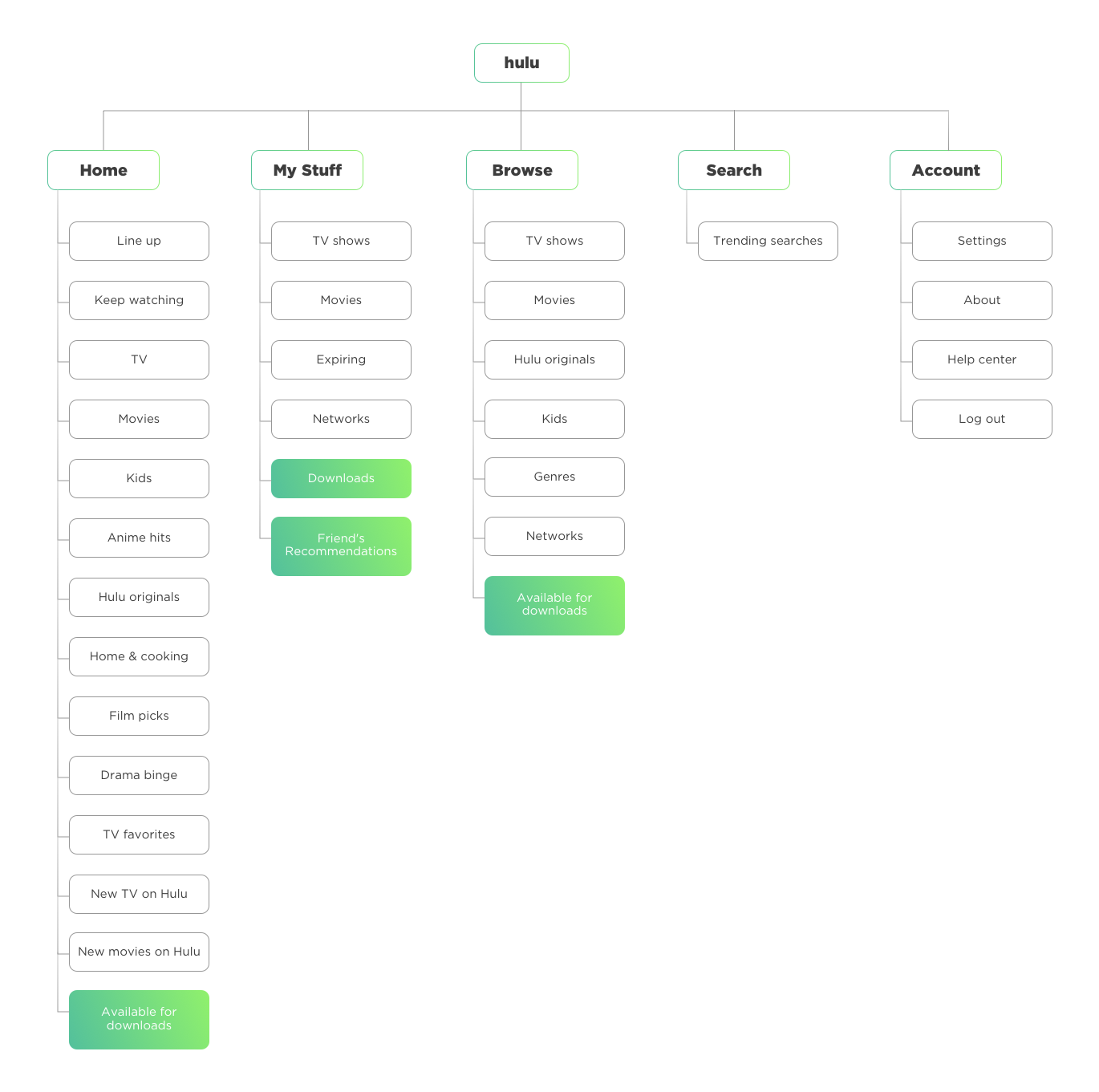
Site Map
I drew out Hulu’s current app map in order to visualize how my new features can fit into the existing system. This helped me better organize and structure the app’s architecture. I integrated my new features under My Stuff, Browse, and Home.
04. Interaction Design & UI Design
Mid-Fidelity Wireframes
I sketched out different wireframes to add to the app while keeping Hulu's branding and current design patterns in mind. I created mid-fidelity wireframes using Sketch and InVision in order to see how my new features fit into the existing system visually.
Example mid-fidelity wireframes of accepting and retrieving friend's recommendation.
Branding & UI Kit
I recreated Hulu’s style guide using the eye drop tool in Sketch and found their font in order to ensure that I’m being consistent with their branding. I also kept in mind their current design pattern and existing icons when I was designing the high-fidelity wireframes.

High-Fidelity Wireframes
I designed high-fidelity wireframes in order to help users visualize how my new features would be integrated with the current app. After creating these wireframes, I made a prototype with InVision for testing purpose.
Usability Testing
I conducted the usability testing with the high fidelity prototype in order to pick my users’ brains. Using high-fidelity instead of mid-fidelity would also allow me to see if the new features are well integrated in the existing app and branding elements. I conducted usability testing with six people who are similar to my persona
Affinity Map
I organized my usability test results into the three affinity map categories: positive, issues, and other in order to gain better insights from the test.
Key Findings
The Positives
Users enjoyed the onboarding process
All six users liked the new features being added: downloading content, and friend's recommendations.
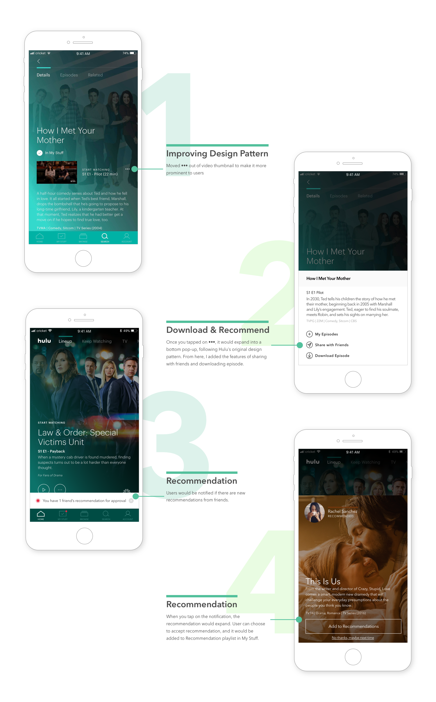
The issues
- Users had a hard time finding where to share their recommendations with friends because the "More" option was blended in the video thumbnail.
- Users expected to be able to download episodes by tapping on "More" option.
The Solutions
- After many debates with my mentor and consultations with my peers, I decided to derail from Hulu’s original design pattern and move the "More" option out of the video thumbnail.
- Rearrange the options in the "More" option bottom pop-up.
Final UI Design
How can we measure success?
We can measure success in the following ways:
- Number of offline downloads made
- Number of friend's recommendations made
- Viewership converted from friend's recommendations
Learnings Recap
This capstone was really fun because I got to play with the already established visual elements from Hulu. It was also challenging because I needed to create features following their current design patterns. I needed to see how my new features related to Hulu's existing mobile app. It was great to hear that all six users I tested loved the idea of being able to download content and share recommendations with friends.
My next step for this capstone would be to continue testing and iterating and confirm my decision of moving the "More" option out of the video thumbnail.

